Healing Earth Branding & Logo Design.
Healing Earth Design is a two-person landscape design company positioning itself as a boutique, sustainable service for environmentally conscious homeowners.
Scope
Client
Duration
Year
/
The Problem
(01)
Two people, one yard, and a brand that didn't fit
I was approached by the founders of a small, boutique landscaping design company, Healing Earth Designs, who were just starting out. Their business is grounded in ecology, with a strong focus on pollinator support, soil health and native plants. They consider themselves a luxury service with a warm, personable approach, carefully considering every detail tailored to the customer's unique property conditions.
They had a stand-in logo that felt thrown together and was nature forward but didn't effectively capture the image they wanted to portray. They wanted something more official, something they could use on work garments, that way they wouldn't look like a couple random hobbits rummaging through someone's yard. They needed a logo and branding that accurately captured their business's unique image. They're a small, scrappy 2-person startup with luxury positioning but still with a warm and approachable personality. What kind of mark can work on two levels, one that clearly feels bespoke and premium but also warm, knowledgeable, and approachable?

/
Discovery
(02)
Understanding the business before touching a tool
During the initial discovery meeting, I started by asking the client about their company. What do they do, what's their value proposition, who's their target audience, what are their desired outcomes with this project. When working with someone new, I like to start with what they know, themselves, before looking to delve deeper. It was here where I learned exactly what their company did and it was truly unique, not something I had ever heard before. They seek to provide a luxury landscaping service that heavily relies on pollinator support and building a robust ecosystem. They use plants that are native to the region and actively avoid using invasive species that could harm the delicate balance within a region's ecosystem.
From that alone, I already had a mental picture of their target audience. In my mind, they probably want to target more affluent early to mid-40-year-olds, or people who may have a bit less money but truly believe in the service they offer. My instinct proved right. When we got to talking about their target audience, they described "mid-30s to 60s, primarily homeowners," although to date their clients have generally been on the older side. They have had a small number on the low end of that range but the common denominator across all of them is they're generally wealthier, which matched what I had suspected.
During this point in our conversation, the idea of this being a limited luxury service was driven home when the client stated, "We kind of want to market ourselves as a luxury service for full installs. Something like: we only have X amount of spaces left to accept new clients this year." The X value will be low, that way they can give their undivided attention to booked clients while also avoiding burnout.
Unlike their competitors, they seek to position themselves as the "companionable and conscientious" option. They make a concerted effort to really understand the needs of the client through thoughtful consultations and transparency at every stage of their process. Interestingly, they don't stick to the same 50-plant palette common among other landscaping companies. This is due, in large part, to their hardline avoidance of invasive plants. Instead they recommend non-invasive alternatives and look at what ecosystem already exists, then look to complement it. That's not something you can do if you run a cookie-cutter operation. It is a very tailored approach and no two yards will be the same.
By this point, I had a very clear picture of what their company does as well as a solid foundation for starting the design process. Without even asking any further questions, I knew I wanted to use a serif font and warmer, nature-forward colors. I still needed just a bit more info to zero in on the final direction. Little did I know that direction was just around the corner.
Now to the crux of the matter, I wanted to know their goals and what they hoped to accomplish with a formal logo. They wanted a formalized logo to use on business collateral and for any potential future advertising. They believed it would give them more formality and uniformity. To me, this translates to more credibility. Finally, one of the members made a statement that gave me the direction I was looking for, something I could latch on to and run with: "We don't look like hobbits in the garden OR Shmoe and Poe, Moe's cousins, digging some holes in a yard." Though the comment was meant as an offhand joke, it immediately jumped out to me.
"They [Hobbits] love peace and quiet and good tilled earth." — J.R.R. Tolkien, The Fellowship of the Ring (Prologue)
I had recently re-read The Lord of the Rings, and the prologue from The Fellowship of the Ring was still fresh in my mind. The mental image I had by this point established for a potential client's yard embodied peace, tranquility, and earth that was well cared for. It stopped me cold, the parallels were undeniable. It was the final piece to the puzzle and I was ready to get my hands dirty.

/
Exploration
(03)
Every element has to earn its place
First, I took all my notes from discovery with the clients and started distilling them down to key guiding keywords and principles. It serves as a reference point and keeps me moving in the right direction. When looking back through our conversation, the biggest keywords that kept popping up or best represented their business were Earthly, Grounded, Sustainable, Healing, and Comfortable. They want a 40-year-old, wealthier homeowner to look at them and have the emotional responses of Home-Like and Warm, like you're walking into a Hobbit's hovel, admiring their garden and enjoying the warmth of their hearth. They still need to feel sophisticated though, clients need to also feel that this service is premium and coming from a place of deep knowledge.
I started by sifting through hundreds of serif fonts, looking for options that strike a balance between boldness, sophistication, and a dash of whimsy. Any that left an immediate gut reaction I set aside for later consideration. Ultimately, I settled on four serif fonts due to their inherent ability to feel more traditional and well established. Those fonts were Adobe Jenson, The Seasons, Roca, and Begum, all of which are on Adobe Creative Cloud. This was a deliberate decision to help future-proof the logo, I wanted any future designers or vendors to have easy access to the fonts. From here, I considered each font, contrasting them against the project's keywords and principles, asking myself which fonts satisfied the most points. Additionally, I wanted a font with a wealth of versions within the family, that way there was ample opportunity for future designers to create visual hierarchy with any future company collateral. Ultimately, I settled on Adobe Jenson for multiple reasons. There are 32 font versions within the family, which erases any concerns about creating visual hierarchy in the future. Beyond that, it fulfilled everything I was looking for. Fonts are critical when it comes to telling a story, each one can tell a different story or elicit a different emotional response. When I looked at Adobe Jenson, I immediately thought of opening an old leather-bound book on horticulture in a warmly lit study, parsing its pages, tracing the lines of text with my finger as I read about some native plant species. There was my whimsy. The font felt soft but professional, with a bit more flow to it compared to the others. It felt steeped in nature, with bolder versions reminding me of attentive calligraphy strokes. None of the other fonts elicited a similar reaction.
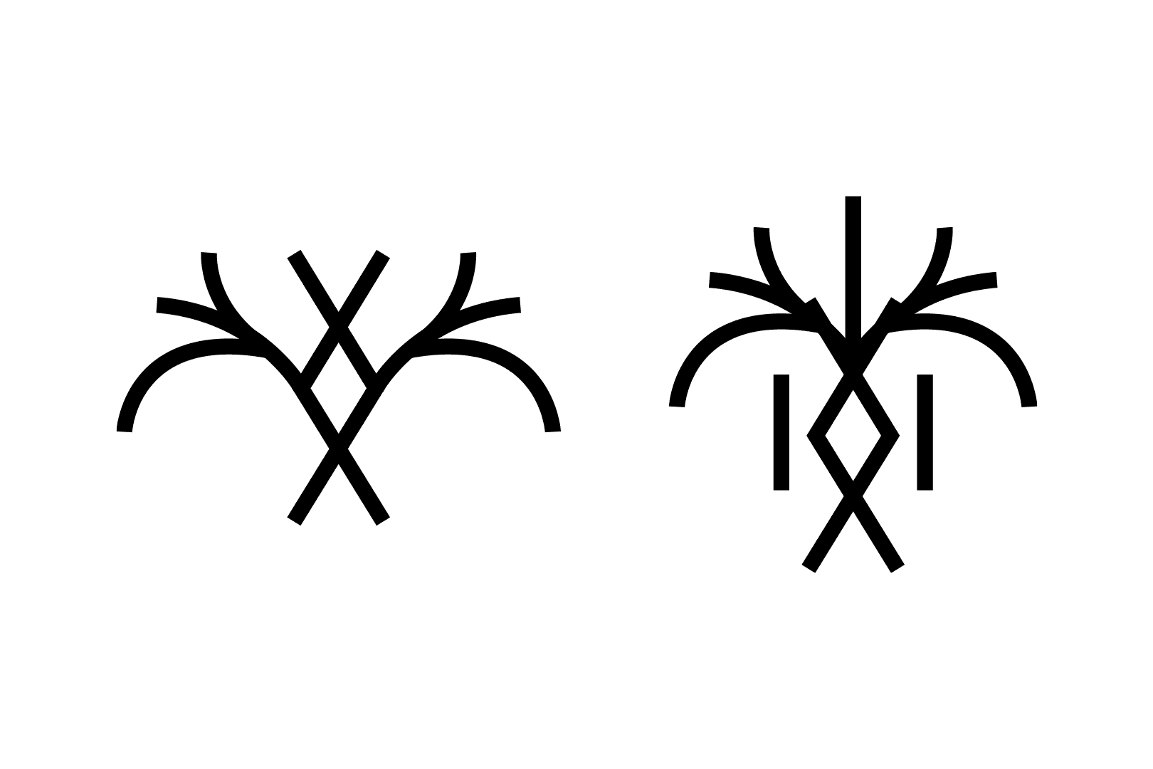
From there, I started to play around with the letters H, E, and D. I personally love Tolkien's personal mark, it's simple but magical and captures his mythos and love for stories. I wanted to explore by emulating that, taking the first letter of each word in the company's name and seeing if there were any ways I could incorporate them together in interesting ways. After several attempts, it became clear that nothing felt like it worked. Everything felt forced, inauthentic, or just did not come together in a meaningful way. It was around this time that I took a step back and tried to look at things through a more abstract lens, maybe I shouldn't take a literal letterform approach and should instead focus on symbols. I had the thought that Tolkien's mark has a striking resemblance to Japanese kanji. Japanese culture cares greatly for nature, and even in dense city centers you can still find aspects of it. They care about nature, growth, and preservation. When you think about it, kanji is essentially a series of symbols. Tolkien is also known for his deep symbol-based marks, which are heavily influenced by Norse runes. It was here where I remembered the story behind the creation of the Bluetooth symbol, it was created by fusing two Norse symbols, Hagall (ᚼ) and Bjarkan (ᛒ). If I couldn't combine the company letters into an interesting mark, maybe I could draw inspiration from kanji and Norse runes to create a mark that also tells a story.


While I was considering possible marks, I was simultaneously using AI to generate some rough concepts. Too often I have used Google search or Instagram to look for inspiration and too often I just end up seeing the same images re-circulated. I took my original drafted commentary post-discovery and dropped it into an AI image generator to produce a handful of concepts. With that said, I will never use an AI image in my final work, it is only a tool to rapidly iterate through concepts and generate new sources of inspiration. I knew I wanted the central focus to be a tree, I kept thinking of things like "the tree of life." Trees are obviously nature-charged: the folklore around "tree of life," "mother trees," and many more speaks to something deeper. Trees protect not only the environment but the ecosystems within which they reside. They are the perfect embodiment of the idea of doing something now that you may not get to enjoy the fruits of, but that will be enjoyed by those who come after you. You are investing in the future, even if you aren't the one who gets to experience it. And though that may seem lame to some, to others it can be a huge source of encouragement. One mark caught my attention. The tree reminded me of the kanji symbol 木, which means tree or wood. I then thought to try and use the Norse symbol Inguz (also called Ingwaz), which translates to "seed" and is commonly associated with fertility. I started to play around with those shapes, working them together and creating some rough prototypes.
While iterating the mark, I always made sure the branches of the tree paid homage to the letter E from the company name, the branches to either side would always appear in pairs of three. It also became clear early on that having the Norse symbol serve as the spine of the tree made the most sense. Narratively, it's the seed that grows to be the heart of the mark, rooting it and connecting it to everything around it. However, the mark was too wide, it didn't sit comfortably within a circle, which I knew I wanted to serve as the anchor for the mark. From here, I slowly iterated through a couple of versions, pulling in the tree branches until I was left with a mark that was a rough version of the final product. I then started to smooth corners and edges so the mark flowed from one part to another, rounding off the corners of each line. The mark still felt like it was missing something though. There was empty space that wasn't doing anything, and I didn't love how the letter H wasn't represented anywhere. I started asking myself, how could I reference the H? Is it even possible? I got the idea to use some figure-ground tricks, using the two vertical parallels of the letter H in conjunction with the Norse symbol to frame the spine of the tree and create a subtle H shape. This also filled in the empty space in a meaningful way. Finally, there was one last pain point, the mark felt too light, too frail. When I think of warmth and hominess, I think of something fuller, and that just wasn't coming through. Thankfully, this was easily fixed by increasing the weight of the mark overall.
The mark was finished, but I still needed to settle on the brand colors. I almost always make a logo that works in black and white before adding color, if it looks good in black and white, it'll look good with color. I knew I wanted to use green, but I didn't want a cliché green. It needed to fit the greater narrative of the project and speak to the client's wants and expectations. Warmth was the key driver behind my decisions. White can feel cold or harsh, but I wanted a light color to contrast a darker one. For the green, I didn't want something bog-standard, that's boring and doesn't tell a story. I simply added a touch of yellow to each, which brought down the harshness of the white and mellowed out the green. The colors complement each other far more than they did before, and more importantly, they make you, the potential client, feel the warmth. This isn't some cold, corporate company that wants to make a quick buck. This is a company that cares about you, your community, and the environment. They are warm, approachable, and knowledgeable. To anchor all of that, I went with a charcoal, less harsh than true black, warmer by comparison, and if you want to get scientific about it, charcoal can be a great agricultural amendment.
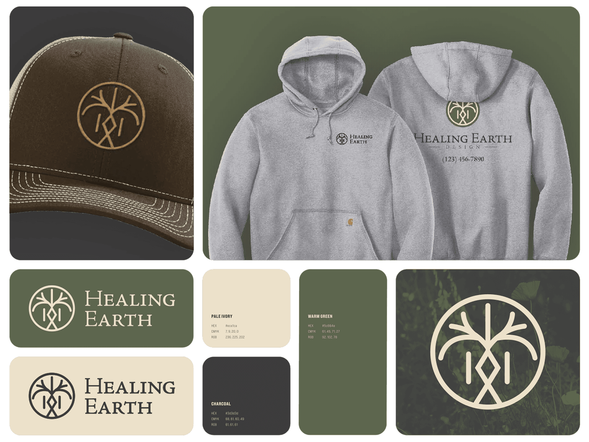
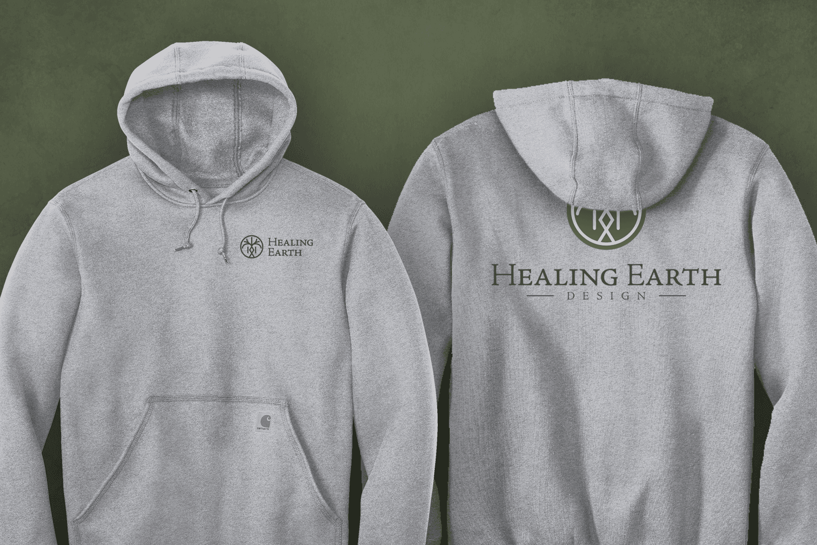
The final step was creating the logo lockups. I typically deliver three versions, a standalone icon, a horizontal lockup for smaller applications, and a full stacked version with the complete company name and any supporting type. Each serves a distinct use case, so no matter the context, shirt embroidery, business card, website header, there's a version of the logo that fits without compromise. For Healing Earth Designs, all three were delivered in a range of colorways and file formats, ready for any vendor or future designer to pick up and run with.


/
Outcomes
(04)
Warm, sophisticated, and built to last
The finished identity system for Healing Earth Designs consists of three components: the mark, the typography, and the color palette.
The mark is a symbol-based logomark built from the Norse fertility rune Inguz, the Japanese kanji for tree (木), and subtle references to the letters H and E from the company name. It is contained within a circle, grounding it, literally and visually, and connecting it to the earth. Every element within is intentional and earns its place.
The type system is set in Adobe Jenson, a serif typeface with 32 variations within the family. It feels traditional and well-established without feeling corporate, warm without feeling casual. It was selected both for what it communicates and for its practicality: as an Adobe Creative Cloud font, any future designer or vendor can access it immediately.
The color palette consists of three colors: a warm off-white, a muted earthy green, and a deep charcoal. Each was deliberately pulled away from its harshest version, yellow tempers both the white and the green, charcoal replaces true black. The result is a palette that feels warm and considered rather than stark or generic.
The system was delivered as three lockups, a standalone icon, a horizontal lockup for smaller applications, and a full stacked version with the complete company name. Each serves a distinct context, from embroidered workwear to business cards to website headers, ensuring the brand works at every scale and in every format without compromise. All files were delivered in a range of colorways and formats, ready for any future use.

/
Outcomes
(05)
Zero revisions
I delivered the first round of proofs alongside a detailed breakdown of every decision, the symbolism behind the mark, the rationale for the typography, the thinking behind each color. I wanted them to understand not just what they were looking at, but why every element earned its place.
They came back with zero revisions.
They were blown away, not just by the logo itself, but by the depth of thought behind it. The care, the story, the layers of meaning that connected directly back to everything they had told me about their company. One of the founders' husbands, who owns several businesses of his own, was so impressed he reached out separately wanting to discuss design work for his companies.
The result spoke for itself.


/
Outcomes
(06)
What went right, and what I'd do differently
This project was a culmination of years of learning, years of working with difficult clients, refining how I communicate, and figuring out how to ask the right questions before touching a single tool. What I've come to believe is that the best creative work happens when a client feels like a collaborator, not a passenger. That means being transparent about decisions, explaining the reasoning behind them, and making it genuinely safe for them to push back.
Every first round of proofs I deliver comes with the same invitation: tell me what you really think. Love it, great. Hate it, even better, just tell me why. "I don't like it" gives me nothing to work with. "It feels too cold" or "it doesn't feel premium enough" gives me a direction. Any information is better than no information, and my feelings will not be hurt. This project was the clearest proof yet that that approach works.
That said, the work wasn't without its behind-the-scenes lessons. Two things I would handle differently on the next project: deadlines and pricing.
Without firm milestones, I found myself deprioritizing the work when other things came up. Though the client set a loose "within six months" window, I should have developed a proper project plan. Even a simple check-in cadence, once a month, once every two months, keeps everyone aligned and the work moving. It wasn't an issue for the client, but it was an inefficiency on my end that I've since corrected.
Pricing was the bigger lesson. I went into the project without a clear framework for how to charge for freelance work at a senior level, which meant the conversation happened too late and too informally. I've since landed on a structure I'm confident in, and it's now the first thing established after any discovery meeting:
"For most projects, I price based on scope, timeline, and deliverables, not by the hour. After a quick discovery call, I'll put together a custom proposal that works for your goals and your budget. The exception is ongoing contractual or retainer-based work, where hourly arrangements are on the table. Either way, no surprises."
Healing Earth Designs was the project where everything I had learned clicked into place on the creative side. The business side is where I did the growing. Both matter, and I'm a sharper freelancer because of it.
Latest Projects.
A curated selection of projects that reflect our commitment to simplicity and purposeful design.